Before getting into the effective use of Effects, I’ll start with a definition. An Effect is any command that alters the Appearance (look) of an object without changing its vector in any way. Filters may be able to make some of the same changes to the look of an object, but that’s where the similarity ends. Filters work specifically by altering paths to change the look of objects while Effects just add a look to the Path. This gives Effects a tremendous advantage. Because the original path remains untouched, Effects can be altered, added to, or deleted at any time.
All of the following objects started as a basic 1" square with a Red Fill and a 2 point Blue Stroke. Then either single or multiple Effects have been added to each to change their Appearance. Yet it’s easy to see with the objects selected that the original vector is intact and is the same in each.
In this tutorial, I’ll be covering the basics of Effects such as: applying Effects to an object; editing existing Effects; adding Effects; controlling multiple Effects; and saving Effects for future use. I will be taking a more in-depth look at some individual Effects in the upcoming tutorials, so stay tuned.
![<a]() Effects
Effects src="/UpLoadFiles/Article/2006-8/0603310921556417.jpg">
|
|
| STEP 1 |
A Menu Overflowing with Effects.. |
|
Effects have been around for several versions of Adobe Illustrator and their importance keeps growing. In Illustrator CS2, Effects have overflowed their menu into other menus as well as palettes. Yet making full use of the powerful commands is puzzling to many.
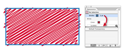
The one thing that all Effects have in common is that they start with a basic path. To keep this tutorial as easy as possible to follow, let’s use a Rectangle. Select your Rectangle tool and click anywhere on the page. In the dialog box that opens, make the Width 2", the Height 1", and click OK.
Using the Swatches palette (Window > Swatches), give your path a “Global Red” Fill and a “Twilight Blue” Stroke. In the Stroke palette (Window > Stroke), change the Weight of the Stroke to 2 points. |
|
|
| STEP 2 |
Take a Look at Your Options. |
|
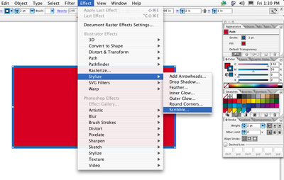
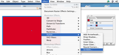
Now, with your object still selected, go to the Effect menu, down to Stylize > Scribble... As with any Effect you choose from the Effect menu, a dialog box will open (some with lots of options, others with as little as one). Scribble offers lots of options, which means that this Effect can offer a wide array of looks ?C all scribbles but with a vast variety of personalities.
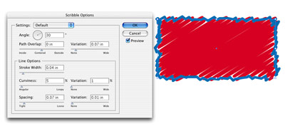
When the Scribble Options window opens, check Preview and it should look very much like the example above (the Default settings). If not, fill in the specifications used and press OK. |
|
|
| STEP 3 |
A Step in the Wrong Direction. |
|
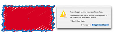
One of the most important things about Effects is that once they’re applied they’re easy to change or delete.
Those familiar with other Adobe applications might automatically assume the first step in making a change would be to select your object and go to the Effect menu > Stylize > Scribble. If you try it, you get a Error message ?C “This will apply another instance of this effect.”
Hmm! So if you click on the Apply New Effect button, it will NOT change the existing Effect but will add the same Effect again to the object, doubling its Appearance. So how do you change an existing Effect? The answer is in the second part of the Error message. |
|
|
| STEP 4 |
Appearances Are Never Deceiving. |
|
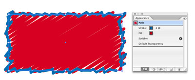
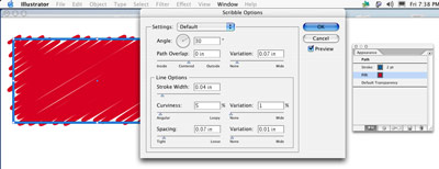
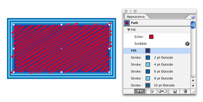
To edit our Scribble Effect, open the Appearance palette (Window menu > Appearance). This palette is kind of like a Layers palette of Effects and other Appearances. Anytime you select an object you can see exactly what Appearances have been applied to it and in what order.
From the screen shot above, I can tell that our object has a 2 point blue Stroke applied in front of a red Fill, a Scribble has been applied to the entire Path and there’s no Transparency.
To change the Scribble Effect, all you need to do is double-click on the listing in the palette and the Scribble Effects Options window will open with all the latest settings.
Let’s Delete this Scribble Effect instead and then re-apply it to JUST the Fill of our object. To do so, simply click on the Scribble listing to select it and click on the Trash button. You should end up with a basic Rectangle with a “Global Red” Fill and a 2 Point “Twilight Blue” Stroke. |
|
|
| STEP 5 |
Scribble in a Fill. |
|
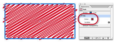
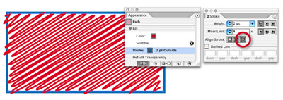
With the object selected, click on the Fill in the Appearance palette to select it. Highlighting the Fill as opposed to clicking on the Path, the top listing in the palette, allows you to make changes to, or add Effects to JUST the Fill, leaving the Stroke unchanged.
Go to Effect > Stylize > Scribble to open the Scribble dialog window. Next, hit Preview to see what happens using the existing or Default settings. You’ll notice that the Scribble has been applied to JUST the Fill and the Stroke is still a plain 2 point Stroke. |
|
|
| STEP 6 |
Let’s Get Personal with Our Scribble. |
|
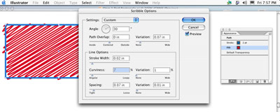
Now let’s make some very minor adjustments to the settings to give our Scribble just the right look. With Preview checked, we can see the changes as we make them.
Under Line Options, make the Stroke Width thinner by bringing it down to .02 in., make the line slightly more curvy by raising the setting to 7%, and click OK to apply.
You’ll immediately notice that Fill is now listed in your Appearance palette with a down-turned arrow next to it and Scribble is a sub-listing of the Fill ?C not a main listing as it was in “Step 4” where the Scribble was applied to both the Fill AND Stroke. |
| STEP 7 |
A Stroke of Genius! |
One of the things I like most about the Appearance palette is that it offers control of Strokes and Fills in ways that were unheard-of before the palette existed. Get ready to do the impossible!
First, we’re going to move the Stroke behind the Fill (Yes! That’s right, the Stroke behind the Fill) because I’d like some of the scribbling from our Fill to run over the Stroke. Select your Rectangle and in the Appearance palette, click on the Stroke listing and drag it underneath the Scribble listing. When you see a double black line with insert arrow on either side, release your mouse. The Stroke should now be behind the Fill. Then, in your Stroke palette (Window > Stroke), click on the third button from the left in the Align section. This will move the Stroke to the outside of the Path, which will be indicated next to the Stroke listing in the Appearance palette.
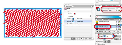
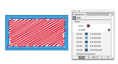
Then, with the Stroke listing in the Appearance palette selected, click on the Duplicate (new page) icon at the bottom of the palette. Our Path now has TWO Strokes of the same color lined up right over the top of each other. Select the bottom Stroke listing and in the Strokes palette, increase the Width of this Stroke to 4 points and then select “Global Pure Cyan” from the Swatches palette and lower its Tint to 50%. (See screen shot below, to the left.)
Now, duplicate this process of adding Strokes alternating the colors between “Twilight Blue” and 50% “Global Pure Cyan” and increasing the width of each new Stroke by 2 points until your Appearance palette looks like the screen shot below to the right.
TIP: It’s easier to Duplicate three of the 4 point Strokes first and then change the Width and Swatch color of each afterwards. In this way, you avoid having to change the order of the Stroke listings.
|
|
|
| STEP 8 |
Fill It Up. |
|
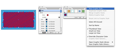
Let’s add a flair for the dramatic with a second Fill. Select your Fill listing in the Appearance palette and click the Duplicate (new page) button at the bottom of the palette. Then click on the lower Fill listing and Delete the Scribble Effect by selecting it and clicking the Trash button. Change the color of this new Fill in the Swatches palette to “Global Deep Sea Blue.” |
|
|
| STEP 9 |
Efficiency of Style. |
|
Now that our “look” is complete, save it as a Graphic Style so you can apply this Appearance to any object with a single click. To do so, select the path used to create the “look” and go to the Graphics Styles palette (Window > Graphic Styles) and under the Options (arrow menu), select “New Graphic Style.” In the window that opens, name the Style and click OK.
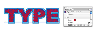
You can now apply this Style to anything including Live (editable) Type. To see for yourself, set some large type. (I used 144 point Arial Black.) Select your type with the Selection tool and click on the Graphic Style.
Talk about efficient. Cool! |