Comic Effect (design)
[ 作者来源:adobespot
编辑整理:
PhotoShop资源网
更新时间: 2006-10-31
录入: 黄叶飞扬 ]
Today, you are going to learn how to make a Comic Effect design, a treatment that you can use on text and symbols/elements. Let's begin.
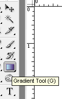
First, make a new 600 x 600 document. Hit Ctrl-A, to select the whole layer. Then click on the gradient tool from the tollbar, it's the 6th one down.

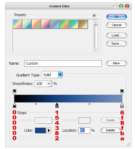
Now, a bar will appear on the top. On the bar with the gradient colors, and that will bring up the gradient editor. Make it look like this. These are the colors I used.

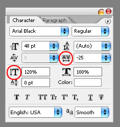
Now, for the text makeover, you are going to need a Comic'ish font. I chose Arial Black. If you don't have that, then select another block'ish font, that's straight edge, not curly. Now, I don't like how it looks now, it's too spaced out. I'm going to take the width between the characters down. To do this, you're going to need the Character Palette. If it's not open, then go to Windw, then click Character. In the character spacing box, click the drop down arrow and select -25. I also want the text to be taller, so in the character height box, I type in 120%. Mine now looks like this.

Now, it looks fine straight, but lets make it that much more interesting by angling it. Hit Ctrl-T, or Edit, then Transform. A bar will appear at the top. It looks like this.
view here, picture too big and will break out frame.
Now, we could have typed -19 into the Angle box, which is three over from the Vertical Skew box, but that would have given us slightly different, but hugely worse. The vertical skew keeps the vertical lines perpendicular with horizontal, but changes the horizontal lines. This subtle difference can make a design average, or great. We want it skewed, so type -19 into the V: box, as circled.
I want to apply a layer style that adds the line art that is commonly found in comics. Click the layer styles button (in the layers paletter) and add a 4px black stroke.

To apply the stroke, right click on the layer and select "blending option". Strike screenshot
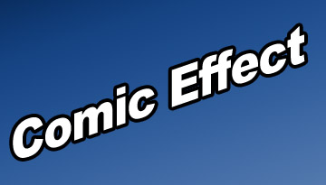
You end up with this.

Now, we are going to add what I call Streak Lines. These, to me, add a more exciting, and comic'y feel, as well as show motion.
With the rectangular marquee tool (M), draw a long, but somewhat thin rectangle. Fill it with white (right click, fill), and apply the same layer style as the text layer.
Repeat the Vertical Skew step, rotating -19 degrees. This is lined up now with the text. Make two more of these, at varying heights. Rotate them, and then position them behind the text.
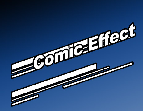
Now, this is where you again, either make it good, or great. They can all not be the same length, so pick strategic places for them to end, like the begining of capital letters, the last letter of a word, the first leter of a word, these are all ideal places. You now have this, or something very close. I've also shown what the lines alone look like.

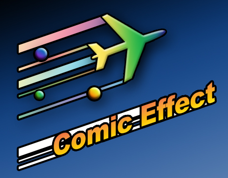
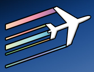
Now, you can also use this for objects. For the lines, pick points where extreme angles or changes occur. In the example below, the wing tips are the most protuded points, so pick these. I also added gradients to the stripes, which add color and flavor.

You can use this technique for many things, and you can change, and explore it yourself to find even more cool things to do with it. Try adding more layer styles, such as drop shadows, bevel and emboss, and more gradients. Look at this rendition, with just a few added shapes and gradients, it looks even better and way more exciting than our first.
